We return to the subject of colour correction and colour grading as I have been working more on learning how to transform my images from flat, over/underexposed, over saturated or bland, to something more vivid and eye catching. It’s a process the footage on pretty much every major film or TV show these days undergoes to give it life, atmosphere, and tone and many modern filmmakers and editors use it on their clips, no matter how short they are to give them a boost.
You may recall the first article I did on colour grading which featured my first attempts at cleaning up older footage from the OVFM archive as part of the showreel I made. I hope this article will show improvements in my understanding and application of this fiddly, trial-and-error process but a worthwhile one.
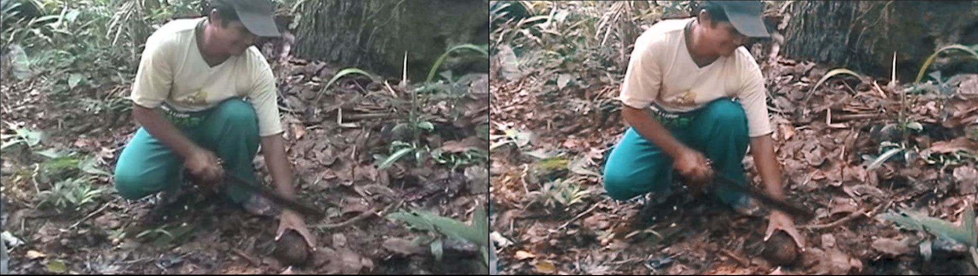
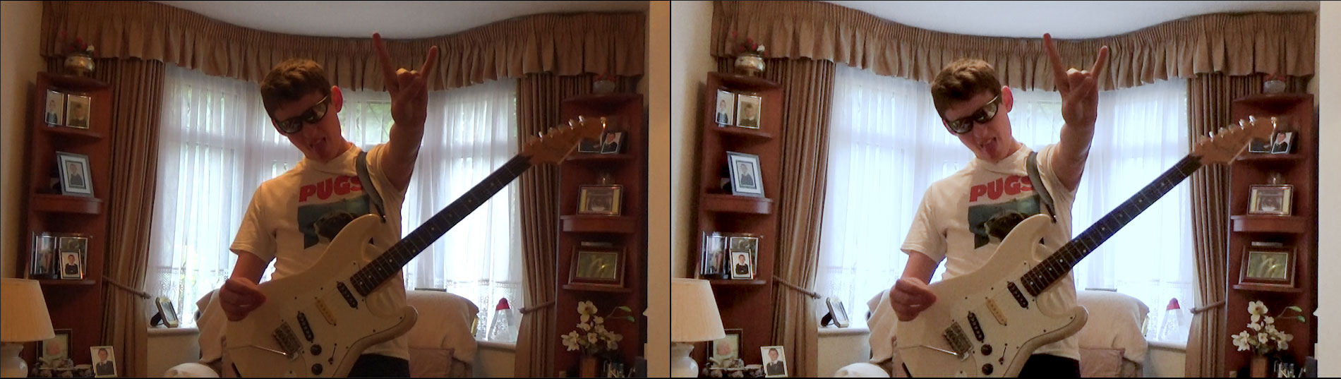
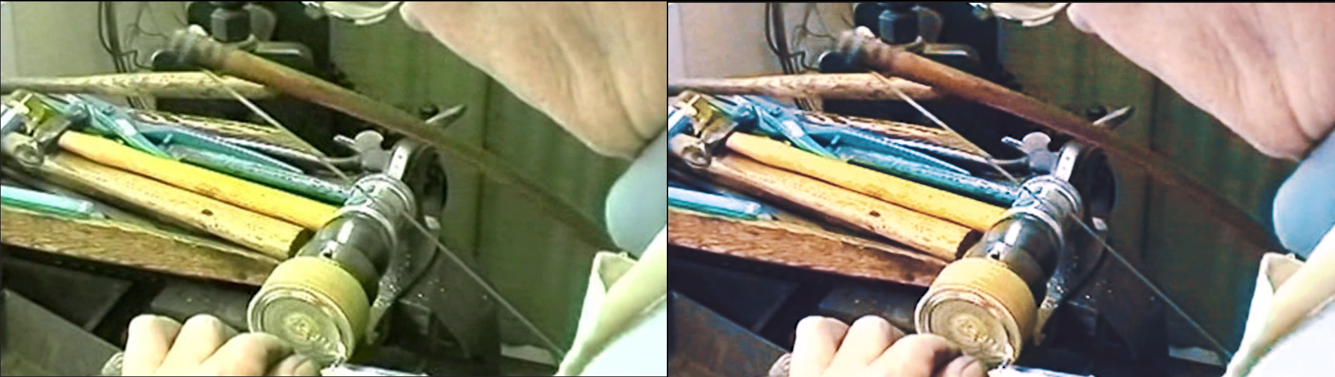
The footage being graded here is courtesy of Chris Coulson and Anna Littler, formerly of OVFM and now running Rentadinosaur, shot on an iPhone in HD 1080p at 30fps and used in the latest showreel I edited for them. It was edited using Premeire Pro CC 2018.
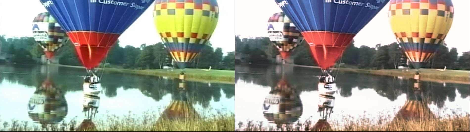
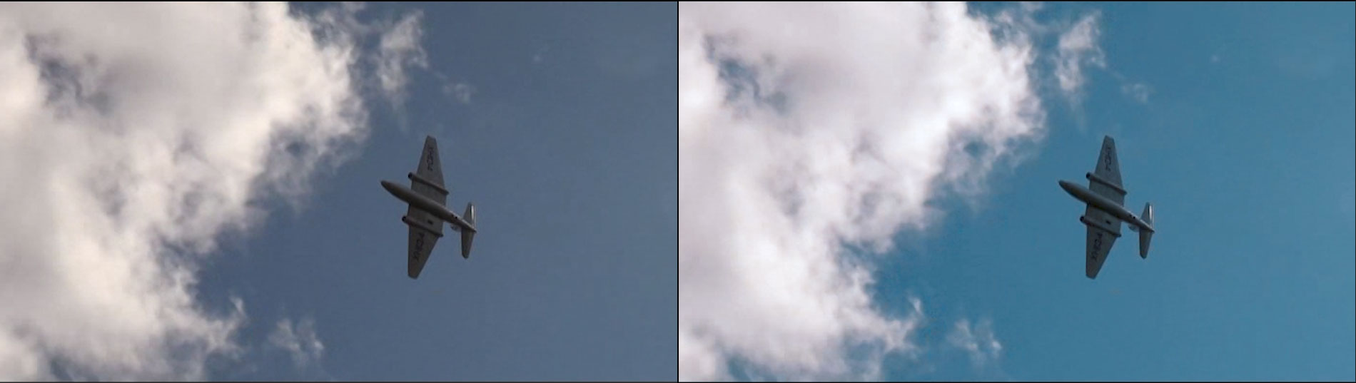
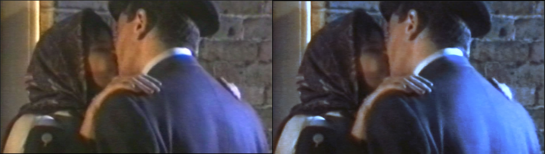
First, please look at this video detailing a number of shots from the showreel with “Before” and “After” examples, followed by a breakdown of the four stages of colour grading used in each case:
As you can see, the environment and lighting quality of the different clips demanded different levels of grading to create a consistent look for the showreel, though I am not yet at the stage where I can make any clip from any source look identical. Hopefully you also noticed that even though the results from each stage might look either subtle or counterproductive on it sown, they are play a vital part in the end result.
Now, let’s take two different shots from the above video and show you the settings I used in each of the four stages to achieve the colour grades I wanted.
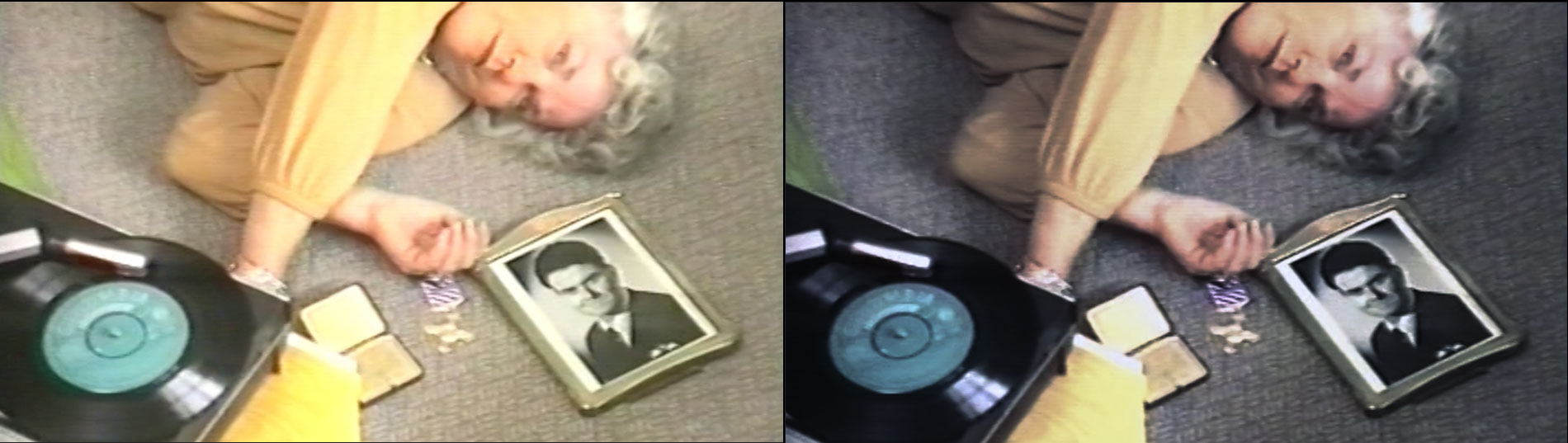
EXAMPLE 1
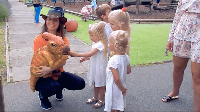
BEFORE
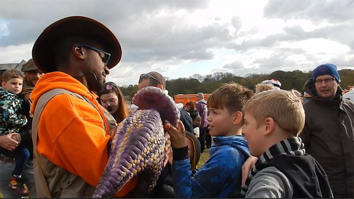
The overcast sky is the first notable thing in this shot, along with the bright orange jacket and general flat look.
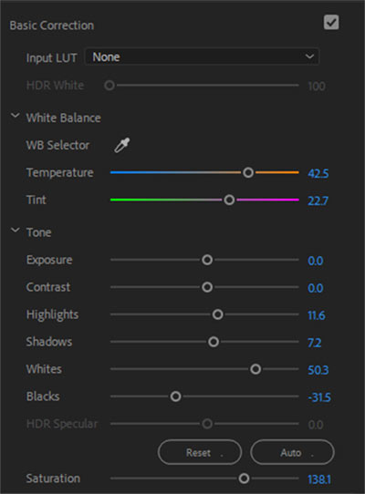
STEP 1 – BASIC CORRECTION
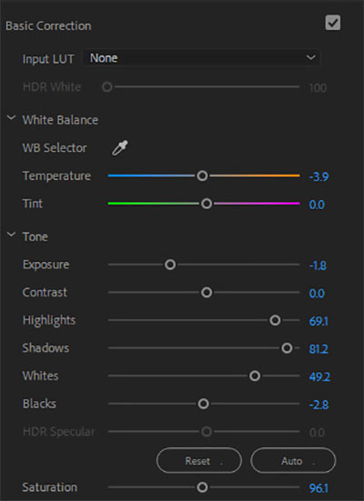
Here I lifted the blacks, and boosted the shadows and highlights to add some depth, cut the saturation and exposure a little, and moved the temperature slider towards the blue to give it some colour. It was necessary to cut the saturation due to the brightness of the orange jacket but this can be fixed in later stages.
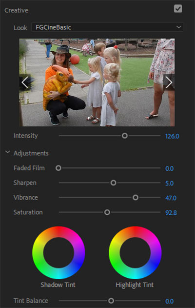
STEP 2 – CREATIVE aka LUT
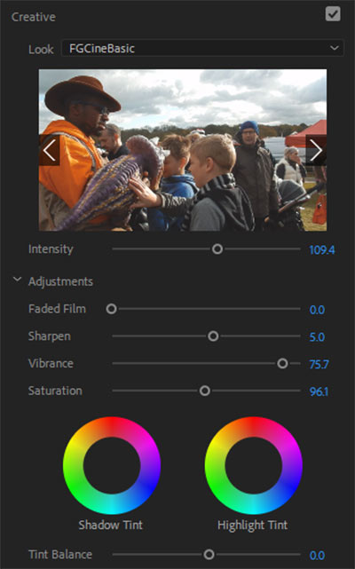
This LUT (Look Up Table) is FGCineBAsic, which I believe is a preset within Premiere Pro. Only minor adjustments here as the default settings mostly provided what I wanted. The intensity is boosted a little as is the sharpness and the vibrancy, whilst again the saturation is cut a little because the vibrancy actually does most of the work, and cutting the saturation keeps the colours from being too strong without losing their tone.
STEP 3 – CURVES
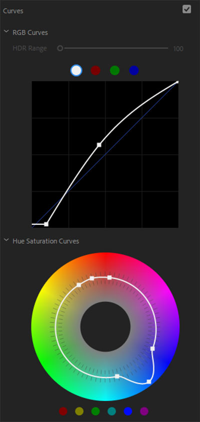
Two curves in use here – general and hue/saturation. In the first I have lifted the black base to give the darker areas in the image a lift without overpushing them in the basic correction settings. The curve in the centre lifts the lightness without flooding the whole image, a very important feature to be aware of and to master. For the Hue curve, I’ve boosted the blues whilst kept the orange very stable. Quite often this doesn’t seem to make a difference at first but when you start cutting primary colours, the effect is palpable.
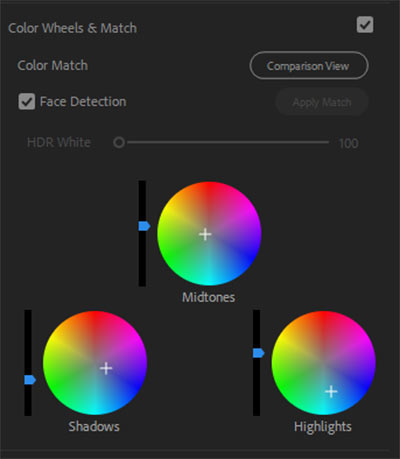
STEP 4 – COLOUR WHEELS
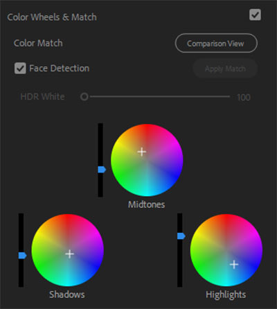
These three wheels make a huge difference to the look of the image as they set the colour tints of the three main facets of its construct. The trick here is that if you boost one colour, you ideally need to counter it by boosting its opposite – like here, the midtnes are more in the orange, so the highlights are set in the blues then boosted above the midtones, which is how the sky in the finished image changes colour, whilst the shadows are kept pretty much neutral colourwise.
AFTER
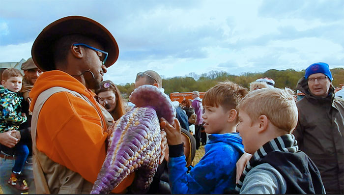
It might seem like the blue are overpowering the image but the intention was not only to make the day look brighter but also to create a filmic look and in this case, the usual trick of boosting orange wouldn’t work due to the orange jacket.
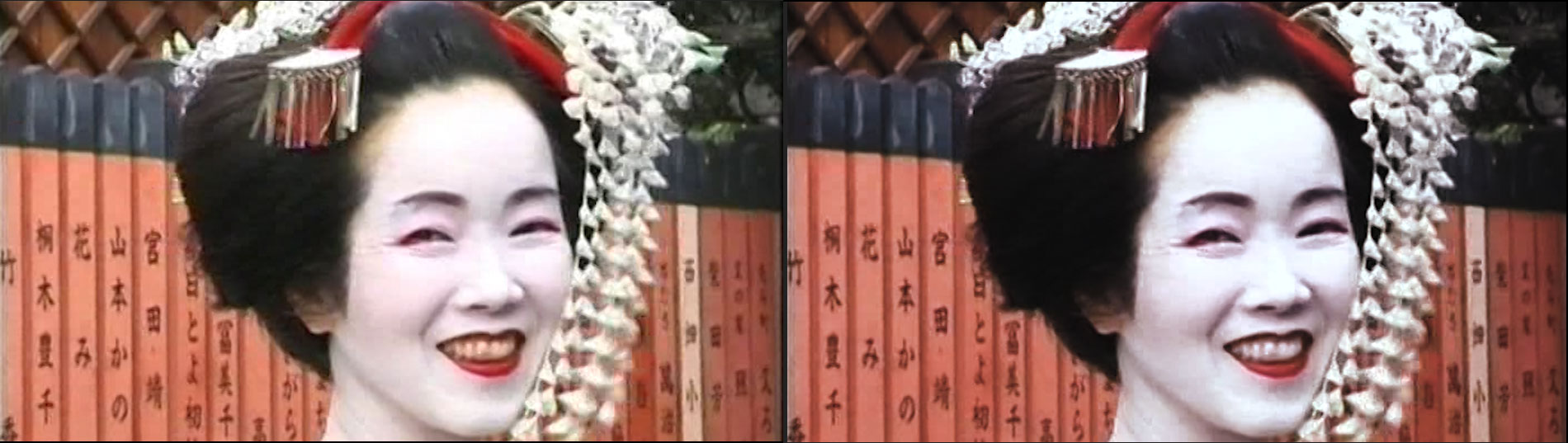
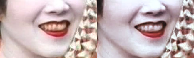
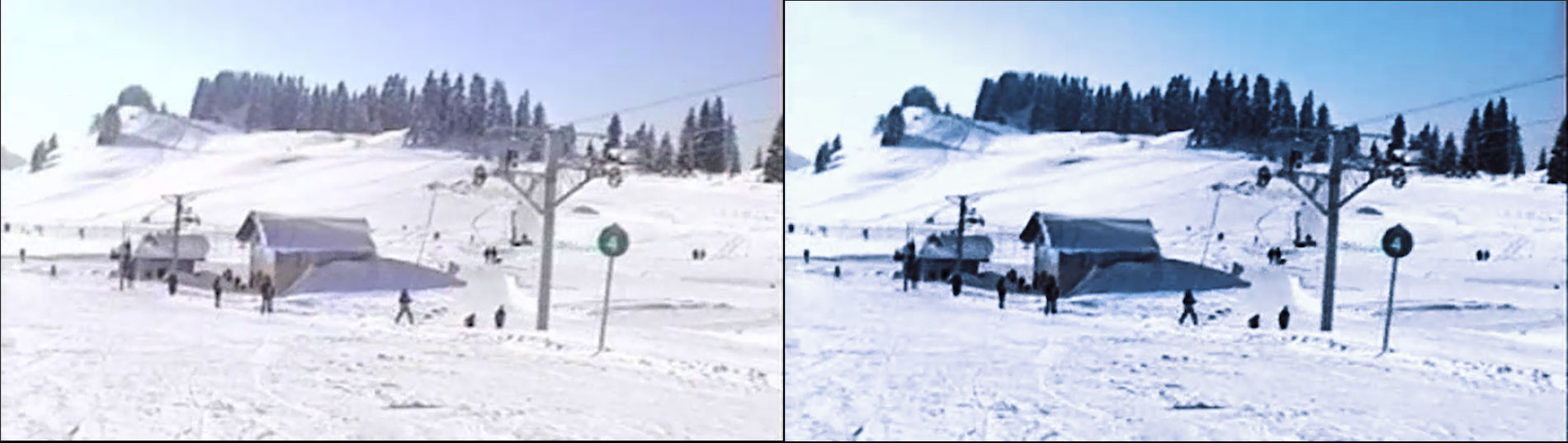
EXAMPLE 2
BEFORE
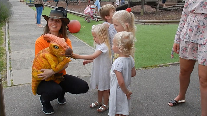
There might not seem anything outwardly wrong with this image, but it is a bit flat, the girls dresses look dull, and the light looks a bit gloomy for a summer’s day.
STEP 1 – BASIC CORRECTION
The first thing you’ll notice is the temperature is set towards a warmer tone whilst the tint is leaning towards the reddish end, which becomes more important later on. The highlights and shadows are centralised for the moment with the blacks cut and the white boosted to give it a lift. Saturation has been boosted but this is dealt with in the next step.
STEP 2 – CREATIVE aka LUT
A combination of reduced vibrancy and saturation to the LUT help level out the saturation boost in the previous step, Aside from the higher intensity, very little was changed here.
STEP 3 – CURVES

Because the blacks were lifted in the first step, there was no need to alter them here, so the only change was to lift the middle of the image to keep the edges dark. For the hues, the blue are again boosted but only slightly this time.
STEP 4 – COLOUR WHEELS
Since the image only needed minor adjustment to give it some life, only the highlights were again give push and the darker shadows cut, just to give them a some presence.
AFTER
Now it isn’t so grey and gloomy, the dresses are whiter and there is more detail in the creases folds and depth to the image. The colours may not be bursting out but the overall feel is more serene and amiable, since the focus is the three girls.
I hope you have learned something from this article and maybe even inspired to try it yourself. I can’t profess to being an expert and I am sure not every example shown will be to your tastes, but it is a vital part of film editing these days and I am keen to improve. I realise that your editor might have a different set up for colour correction and grading, but I hope you can use these settings as a guide to know what to look for in your set up.
The secret to good grading is creating a memorable and striking look for your footage that doesn’t look like it has been graded at all, depending on what you want the visuals of your film to convey. Maybe one day I will get there and perhaps so will you.
Thanks for reading and happy grading!