by
Lee Relph
You may recall last year John Epton held a talk on colour correction and colour grading (the video is HERE in the Members’ Only section) as an important step in the editing process. Editing suites have come a long way over the past decade or so and their colour correction facilities in particular have become much more sophisticated in what they can do for our footage yet are relatively easy to use.
Thanks to these developments it is now possible for amateur filmmakers like ourselves to create better looking clips and films and depending on the software – with an industry standard colour graded aesthetic. It can also help spruce up any old footage recorded on archaic formats like mini DV or video tape, give them a new lease of life, and not look so dated in comparison to modern digital output.
Recently I compiled and assembled a new SHOWREEL for the club for which I delved into the available archive of OVFM for snippets to use to showcase the array of films we have made over the past 60 years and the different genres. However, because much of the content was so old, the quality of the footage not only showed its age through faded colours or overexposure but also stood out against the pristine veneer of current clips shot with digital cameras.
This presented me with a challenge in trying to rectify this with a view of creating some kind of consistency across the whole presentation. If I’m being honest, this was possibly more time consuming than animating the text in the clip which in itself was a lot of trial and error! Luckily, I am currently using Adobe Premiere Pro CC 2018 as my editor which has an excellent and intuitive colour correction tool that was very much up to such a task.
Premiere Pro’s basic correction tools would have been sufficient in restoring some of the major picture elements (like contrast, exposure, highlights, saturation, etc) to something resembling their original state but a fairly recent and very handy tool to add extra depth to the colour is the LUT – Look Up Table. I don’t know if these have crossed over to other editors but a LUT is basically a preset to be added to a clip that has been set to create any kind of tone, atmosphere and colour boost to get the image you want.
Using LUTs is how we can achieve the professional looking colour grading I referred to early, by altering some of the picture’s dynamics to replicate certain looks, as well as the setting of specific cameras. These are not fixed so one can fiddle with them to suit their needs otherwise you can simply apply them to your clip and transform it immediately.
The most popular LUT among editors today is teal and orange which, as the name suggests, manipulates the blues and oranges to create a bright and vivid look and bring out some interesting hues in the process. You’ll have seen this effect used in many recent film, TV shows, and adverts which show off its flexibility. I also used it here too, as you will see in this selection of examples from the showreel of my own attempts at colour correction and grading.
Please note the image on the left is the original untouched footage whilst the image on the right is the “corrected” version. Click the image for a large version.
As you can see in this first example the original clip is lacking in depth and definition, and the colours are rather washed out as a result of being shot in natural light on tape then later digitised, losing a lot of its lustre. By altering the basic settings then adding the teal and orange LUT with a few minor adjustments, the new version looks and feels warmer and the colours and details stand out more:
The next example isn’t perfect giving the age of the original clip but I feel it has more definition and the geisha stands out more as again, the natural light seems make everything seem flat. The teal and orange LUT also give the background a bit of a lift too:
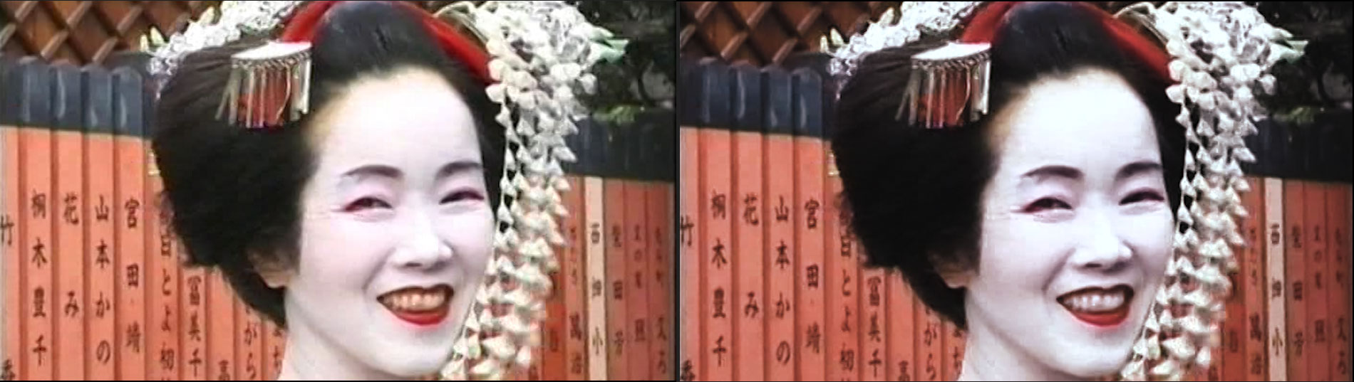
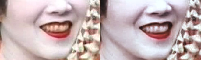
Also note that I used an additional mask to clean up the geisha’s yellow teeth:
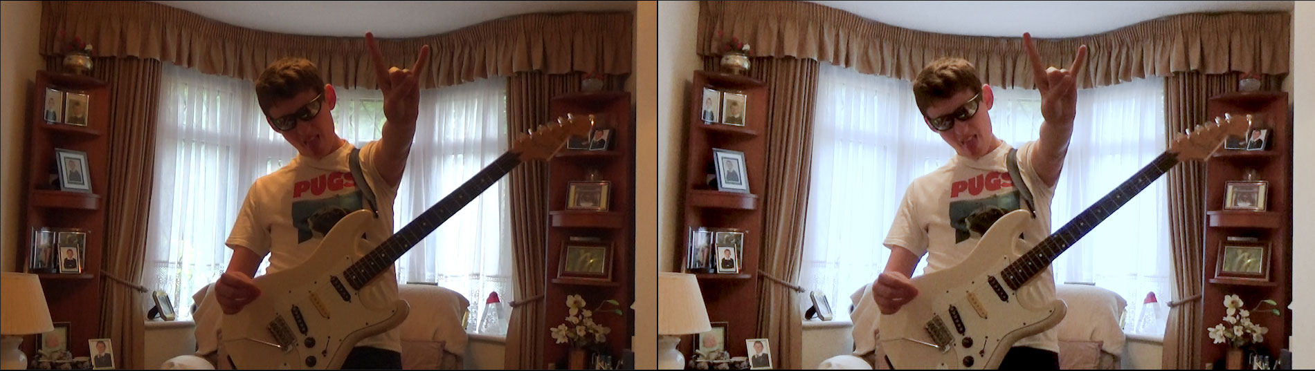
One of my own clips now to show that even digital photography doesn’t automatically guarantee perfection. This was shot with my nephew in the living room and me in the adjacent dining room, with the main overhead light in the living room coming through orange tinted bulbs and the light from outside in the background. There is a slight compromise with the glare and exposure of the background light in the second image otherwise an overall improvement nonetheless:
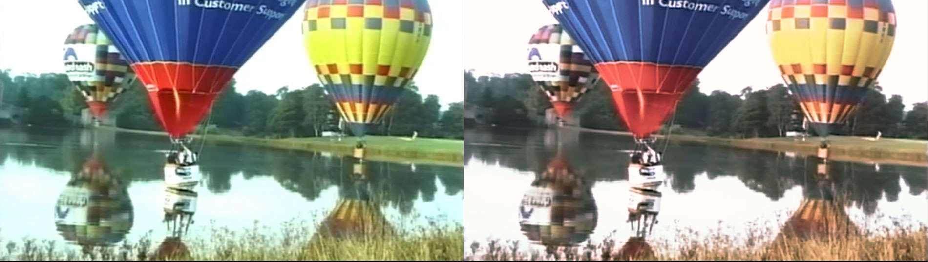
This shot of the hot air balloons was another tricky one to get right because of the varied colours involved. I believe it was also shot very early in the morning so the light wouldn’t have been at its strongest and presumably on tape. The colours might look paler in the second shot but I would venture they are closer to how they were at the time, whilst the added depth to the landscape is more natural looking too:
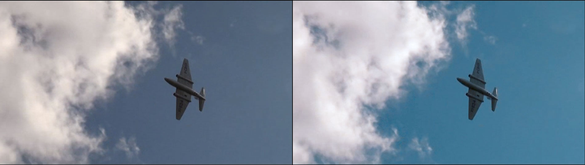
Here’s another recently filmed shot on a digital camera that looks okay as it is but with the orange and teal LUT the blue skies are given a nice summery boost. Even the smallest touch can yield some great results:
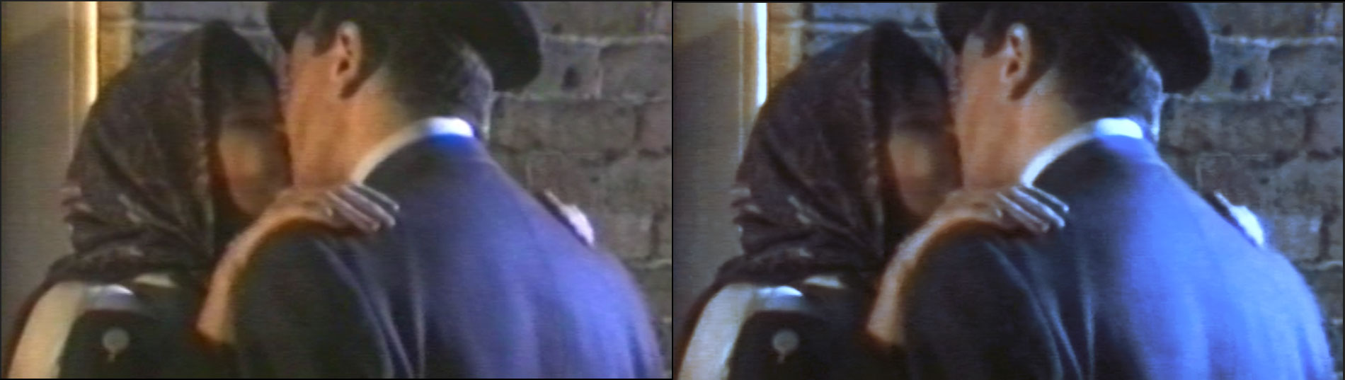
The next two examples are from the same film, and I’d wager were shot on video tape! The first was a nighttime scene set during the war which was very hard to work with, as the light was intermittent thus there was no stability in the brightness or colour. Again, it was more about making the colours look more natural:
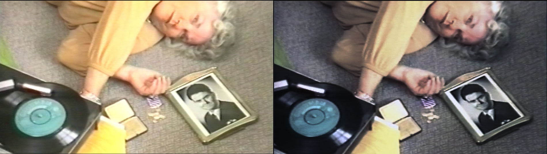
Clip number two from this film was shot indoors and whilst it looks alright, it is in fact lacking in contrast and everything is washed together by the light, perhaps a casualty of being passed through various different formats over the years. Being darker and less saturated brings out the “true” colours of the yellow jumper and the grey carpet:
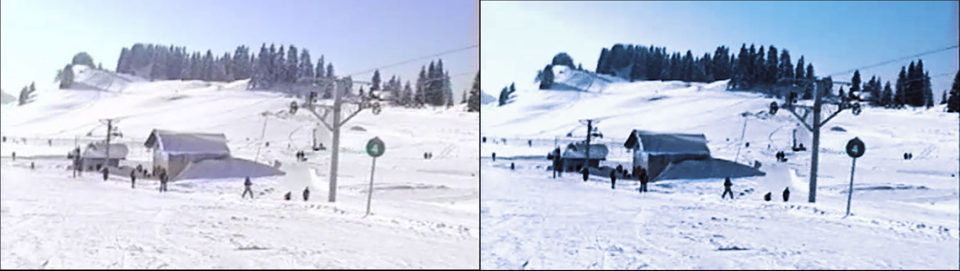
Another very challenging older clip that was shot outdoors where the light reflecting off the snowy landscapes turned everything white! The orange and teal LUT gives the sky a refreshing blue tint as opposed to the pale mauve in the original to compliment the renewed sense of definition of the foreground objects:
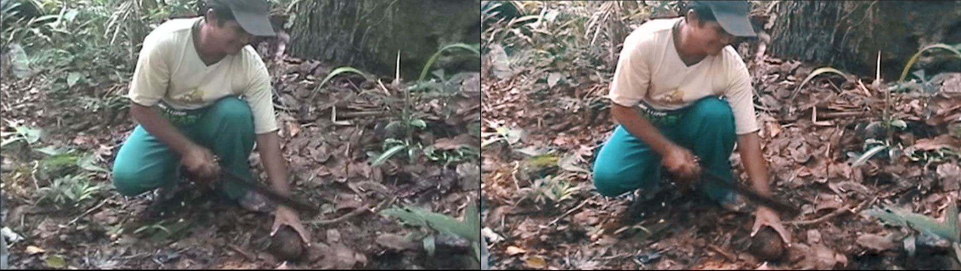
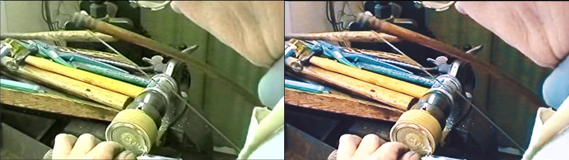
Finally, the hardest clip of them all. Like the snow in the previous example, the location of the workshop dictates the lighting of the clip along with the age of the footage and the medium it was filmed on. As you can see, everything is bathed in green robbing the individual elements of their own colours and the picture of its depth. A lot of fiddling was involved in getting the exposure and definition right whilst our favourite LUT also needed some twiddling to restore the original colours to their former glory:
Now, I’m not going to say that these are by far the most perfect examples of what colour grading can do but I learned a heck of a lot in doing this and given my lack of experience and the quality and age of the clips, I am content with the results, and I hope this has been informative for you too.
So, next time you have a clip that looks a bit off or needs some tidying up, take a look at John’s tutorial on colour correction and, if your editor allows it, get some LUTs and make your old clips or your new footage look like a million dollars! There are plenty of further tutorials online about LUTs and colour grading so look them up and give it a go yourself!
Thanks for reading.
Lee
A great article.
You can’t beat teaching by example.
I have only seen your new show reel once but I remember it did look really good and obviously benefited from your colour grading work.
I covered the basics of colour correction and you have taken it to the next stage. Let’s hope members really read this will be inspired to have a go themselves.
Well done.
Thank you John!