
Hopefully, you will recall John Epton’s video tutorial on this particular subject and my companion piece article explaining the benefits of colour correction and colour grading to our films. Since then I have been delving deeper into the practice of colour correction and learning more grading techniques to give my films a bit of a lift, and now I never leave a single frame untouched.
As my eye has gradually become acclimatised to this aesthetic phenomena it is possible to spot when a film has been graded, or had some correction applied to it. During the most recent Top Ten evening, our chair Jane Oliver showed her part black and white, part colour film Braveheart. It was beautifully shot as ever but for me the images didn’t leap out of the screen as they could have.
I asked Jane if she added any correction or grading and she admitted she hadn’t, so with her permission I downloaded an older version of her film from our Vimeo account and set about applying some basic (or primary) correction some of the shots. I can’t say they are perfect or to professional standard but are good enough for an illustration of what can be achieved.
N.B – Because some of the footage was shot in the dark there is some noise present on a few clips. Unfortunately, my editor doesn’t have a noise reduction function to clear this up – Resolve, however, has an excellent one – so you will witness some attempts to disguise this by making some of the clips a bit darker.
The following video features “before” and “after” examples of how even basic colour correction can add so much punch to your images:
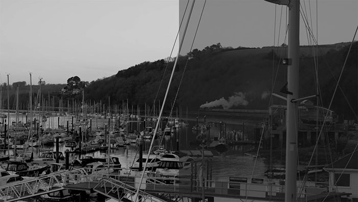
Straight away, you can see how much difference it made to the black and white footage, the simple raising of the shadows and darker areas and shifting of the lighter areas to create a sense of depth and definition to the image. There is now balance between the various shades of black and white where before everything was one shade of grey, and individual features stand out more prominently.
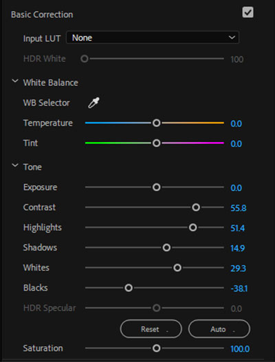
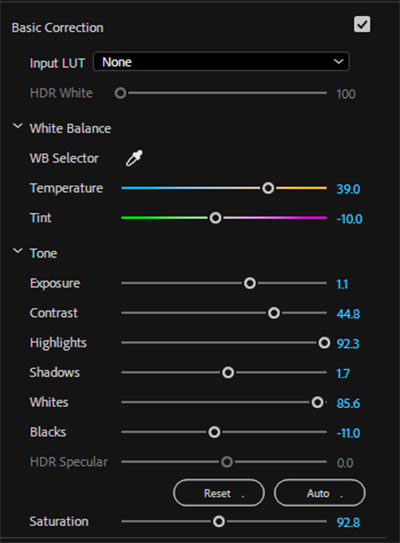
Here is an example of the settings I used (my editor is Premiere Pro CC 2018) and the clip it pertains to:
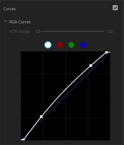
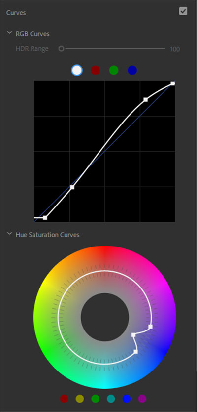
The secret weapon in this case is the curves, which adds the final tweaks to the brightness and contrast of the image with greater precision, yet is the most subtle of all the correction tools:
For the colour clips, it might be that they are too dark for some tastes. Shooting at night or in low light is hard to get right and, as mentioned earlier, invariable incurs noise on your clip unless the camera is set-up properly and the scene is appropriately lit.
This almost required different correction setting, including some finer touches brought out by using the temperature and tint sliders:
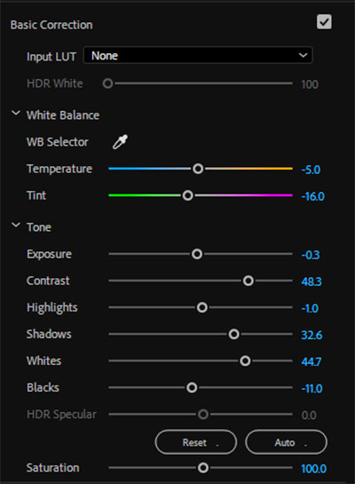
In trying to compensate for the noise in some the shots I made the sky and surrounding areas a little darker which enhanced the brightness and colours of the lights, as well as adding depth to the refracted light on the walls and trees, etc. Admittedly I did use some extra tricks here to give the colours a lift but not to the extent of overhauling the entire clip.
For instance, I cut back on some of the blues to allow the other colours to shine as represented by the colour wheel:
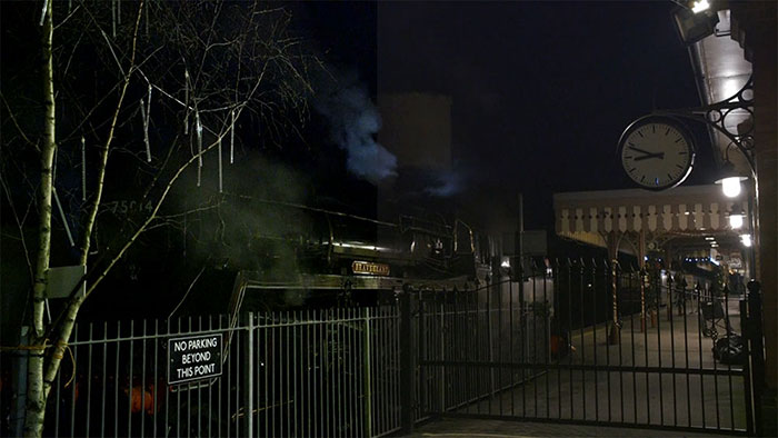
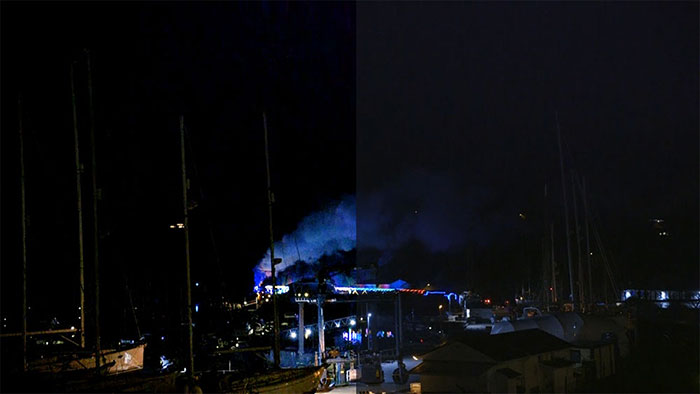
Whilst in this clip, you can see the smoke cloud is barely defined and the colour of the lights almost imperceptible, but after correction the vividness of the blue come through very clearly:
It might look intimidating or even voodoo to some of you but it really isn’t. It is time consuming when you first try it but after a while, things fall into place and once the basics have been mastered it is simply a matter or making the other bits work in tandem with them. And remember, everything I did here was quick and basic for the sake of this demonstration – had I attempted a full colour grading, it would be much different!
And the best part of it all is that YOU can do it to. Yes, you. It really is as simple as moving a few sliders about (depending on your editor’s layout) and recognising where best to cut or boost the corresponding part of the image.
Like most things, it takes a while and plenty of trial and error at first, but it will fall into place eventually, and you’ll find colour correction will be as natural to your editing process as adding a transition or title. The key is not to look at it as more work but as making your images that whole lot better.
I hope you found this article useful and the video will encourage you to try basic colour correction for yourself to get the best out of your images. Whatever editor you use, there are bound to be online tutorials to show how it’s done – that is how I learned it – and if I can do it, you can do it too.
Thanks to Jane for the use of her footage and thank you for reading!
Great article Lee – thanks for sharing.
Thanks Bob!
Excellent Lee, thank you. Jane
Thanks Jane!
Lee. A great article. The illustrations of before and after are very helpful.
As you say, the key thing is for members to try it on whatever software they have. You are certain to make an improvement to the look of your films.
Remember almost every film you see on tv now has input from a Colourist.
Image adjustment is a vital part of filmmaking.
Thanks John!